2017 Kantar Information is Beautiful Awards announce groundbreaking shortlist
The outstanding shortlistees in 2017 range from leaders of data visualisation to corporate projects and students, and highlight an up-and-coming data visualization culture in China.
The full shortlist is available to view online here.
The shortlist for the Kantar Information is Beautiful Awards 2017 is announced Thursday 19 October. Celebrating global excellence in data visualization, infographics and information design, the Awards give $20,000 across eight new subject-based categories in 2017.
>> Free to use images available on request, or at: www.informationisbeautifulawards.com <<
From gender and cyberbulling to global issues of terror, migration and climate change, graphics cut through accusations of ‘fake news’ to tell stories about what matters to people right now, whether it’s the music of David Bowie and how hip hop is turning on Donald Trump, or where to get a good meal in New York.
Data visualizers are expanding the definition of infographics, moving beyond pencil and paper to creating innovative projects including a font made of data and physical data objects made from materials including clay pottery and cigarettes.
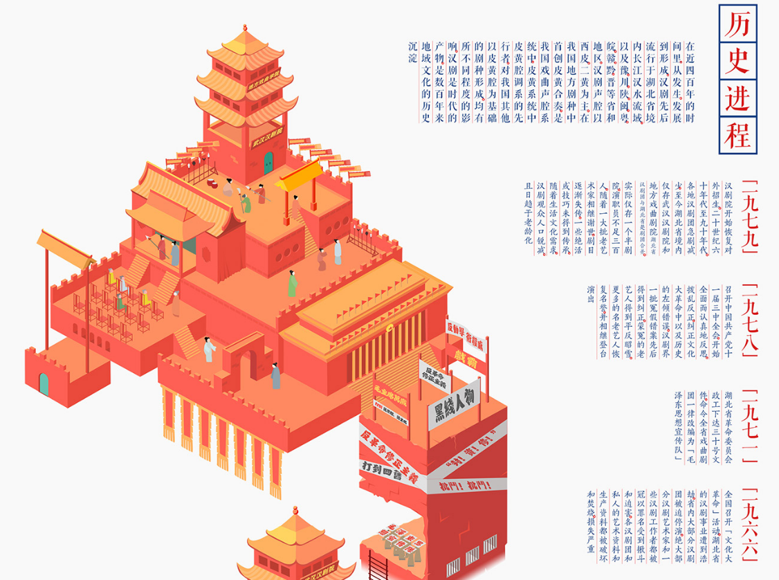
The awards also highlight new and exciting markets for data visualization in the non-English speaking world, including two shortlistees from India and a record number from China.
Judging is led by an expert panel of judges and includes a public vote that opens Thursday 19 October at www.informationisbeautifulawards.com.
KEY DATES:
Public voting closes: Friday 27 October, 23:59 PST.
Awards Ceremony: Tuesday 28 November, London.
Media accreditation is available for this event.
Now in its sixth year, the Awards was founded by data journalist David McCandless, author of
Information is Beautiful, together with Aziz Cami, then creative director at Kantar, now succeeded by current creative director Emma Whitehead.
David McCandless, Awards founder and author of Information is Beautiful, said:
‘The terrific data visualizations in the 2017 Shortlist leap over, under and through “fake news” to help us see and understand the massive changes of the past year. Data takes us to the truth and facts behind everything from asteroids to climate, migration to Trump. And visualization can give us fresh insight into complex cultural issues like trolling, the gender gap and even how words are used - which we’ve captured by adding a new category, People, Language & Identity.’
Judging is led by a global panel of experts drawn from a range of sectors from arts and media to health and technology. They will consider entries based on excellence in design, storytelling and research plus how well they illuminate the subject area.
Mona Chalabi, Data Editor Guardian US
Giorgia Lupi, Accurat co-founder and author of Dear Data
Nigel Hurst, CEO, Saatchi Gallery
Mark ‘Spike’ Stent, Multi Grammy Award winning music producer (Lady Gaga, Madonna)
Bidisha, author, journalist, broadcaster and activist (Radio 4, Newsnight)
Alice Taylor, Walt Disney StudioLab
David McCandless, Creative Director, Information is Beautiful Awards
Fernanda B. Viagas, Co-Leader, Google “Big Picture” data visualization group
Emma Whitehead, Creative Director, Kantar
Alberto Cairo, Knight Chair in Visual Journalism, University of Miami
Charles Seife, Science author and Professor, New York University
Nadieh Bremer, Data visualiser and astronomer
Weiyi “Dawn” Cai, Data journalist
Max Fraser, Director, London Design Guide
Gail Cardew, Director of Science & Education, The Royal Institution
Andy Cotgreave, Technical Evangelism Director, Tableau
Kelly-Ann Erskine, Fidelity Investments
Gyorgyi Galick, Design Researcher, Future Cities Catapult
Julien Guillot, BiG Infographics agency Paris
James Harkin, Director, Center for Investigative Journalism
Lorraine Hawkins, Head of Digital, World Cancer Research Fund
Ritchie King, Senior Editor for Data Visualization, FiveThirtyEight
Cole Nussbaumer Knaflic, Storytelling with Data
Kim Rees, Head of Data Visualization, Capital One
Select judges are available for feature and comment.
Example shortlistees below - full shortlist is available to view at this link.
CURRENT AFFAIRS & POLITICS
Want to fix gun violence in America?
Analysis of georgaphic inequalities in gun violence in the US
by The Guardian
10,000 words ranked according to their Trumpiness
Analyzing the language used by Trump’s supporters and opponents uniquely illustrated the deep urban-rural divide across the country.
By Nikhill Sonnad & Keith Collins
SPORTS, GAMES & LEISURE
Rhythm of Food
Why is September 15th an important day for cheeseburgers? How did Ariana Grande influence Google searches for donuts in 2015?
by Moritz Stefaner, SImon Rogers et al
Berlin Marathon 2016 – how fast your city runs
An interactive map following runners of the Berlin Marathon in time lapse.
By Berliner Morgenpost - Julius Troeger, Andre Paetzold and team
PEOPLE, LANGUAGE & IDENTITY
Are you sure you want to smoke?
Average annual cigarette consumption of smokers in Italy and the resulting loss of life as infopoetry.
By Giacomo Flaim
City of Women
A feminist city map to a renamed city, from an upcoming creative atlas of New York City
By Rebecca Solnit, The New Yorker
ENVIRONMENTS & MAPS
#tagsandthecity
Subway stations named after the Instagram hashtags most popular around them
By Tin Fischer, Jug Cerovic and David Goldwich
Lights on and lights out
The planet by night: showing urban population growth or decline by how much artificial light is switched on or off
by John Nelson
HUMANITARIAN & GLOBAL
Mapping Global Refugee Movements
How have global refugee movements developed since the end of the Cold War? Where did refugees come from and where did they go?
By Sven Cornehls et al. University of Zurich
How a Melting Arctic Changes Everything
Animated map showing how - like compound interest - small changes can lead to the Arctic becoming much less Arctic very quickly.
By Eric Roston & Blacki Migliozzi, Bloomberg
ARTS, ENTERTAINMENT & POP CULTURE
OddityViz
A visual deconstruction of David Bowie’s 1969 track ‘Space Oddity’.
By Miriam Quick and Valentina D’Efilippo
The Unlikely Odds of Making it Big
Data from 75,000 concerts in New York analysed to predict if your favourite band will succeed
by Russel Goldenberg & Dan Kopf, The Pudding
UNUSUAL
AtF Spark - Code-free Sparkline Typeface
a font that allows for the combination of text and visual data to show an idea and evidence.
By After the flood
How To Fix a Toilet (And other things we couldn’t do without search)
All the “how to” advice we find from searching the internet. Which countries need to know about love? Money? Measuring bras?
By Xaquín G.V., Simon Rogers & Google News Lab
SCIENCE & TECHNOLOGY
There’s Big Money to be Made in Asteroid Mining
If humans were able to mine just one asteroid, they could extract quintillions of dollars in gas & minerals.
By Valerio Pelligrini, Wired
Nutrition Label
A redesign of the nutrional label of food products, aimed to better enable healthy, data-driven choices
By Paul Button
About the Kantar Information is Beautiful Awards
The Kantar Information is Beautiful Awards celebrate excellence and beauty in data visualization, infographics and information design. The Awards were set up in 2012 and are open to creators from across the world - from rising stars, students, and individual practitioners, to established studios, media brands, NGOs and more. Community-driven, with expert judges and members of the public contributing to the decisions over who wins, the Awards give out $20,000 annually.
In each category Gold winners receive $1000, $500 for Silver and $250 for Bronze. $1000 prizes are also awarded in Non-English Language, Best Studio, Best Individual, Rising Star, Visitors’ Vote.
www.informationisbeautifulawards.com
For all media enquires please contact Stephanie Speight or Ashton Bainbridge at FMcM Associates on 0207 405 7422 or email stephanies@fmcm.co.uk or ashtonb@fmcm.co.uk


