
Kantar Information is Beautiful Awards 2016 shortlist announced & voting opens

The shortlist for the Kantar Information is Beautiful Awards 2016 has been announced today. Celebrating global excellence in data visualization, infographics and information design, the Awards gives $30,000 (£20,000) across 15 categories each year.
Spotlighting the broad spectrum of data visualization creativity around the world - from students and individual practitioners through to NGOs, established studios and media brands – this year’s shortlist reaffirms the art form’s growing international importance.
Judging is led by an expert panel of 30 judges but includes a public vote that opens today at www.informationisbeautifulawards.com.
From the civil war in Syria to gender representation in Hollywood films, graphics drawing clarity to the news stories of the past 12 months feature strongly, with global migration, gender & diversity, the Olympics and the US election inspiring entries on the shortlist.
The shortlist also spans a breadth of global cultures, from a 126 metre tall Star Wars infographic and study of US baby names shortlisted alongside the Dalai Lama’s Atlas of Emotions, a project visualising all roads to Rome and an infographic map of Mexico.
Now in its fifth year, the Awards was founded by data journalist David McCandless, author of Information is Beautiful, together with Aziz Cami, then creative director at Kantar, now succeeded by current creative director Emma Whitehead.

Beatles Analysis by Adam E McCann, which is shortlisted in the Infographic category.
““With more entries in 2016 than any previous year, this is undoubtedly our strongest shortlist yet. It makes sense as the art and science of making information beautiful is now a staple part of our media diet. Whether it’s rich interactives allowing us to explore the complexity of war in Syria or stark graphics helping us to understand the gender gap at a glance, visualization helps turn data into something people can see, can feel, can understand. We’re delighted to be working with Kantar to shine a light on this growing community of artists, designers, journalists and coders.””
KANTAR Information is Beautiful Awards 2016 shortlist
● Public categories – Gold ($1,000), Silver ($500) and Bronze ($250) in each: Data Visualization, Infographic, Interactive Visualization, Data Journalism, Dataviz Website, and Dataviz Project
● Special categories (at judges' discretion) - $1,000 in each: Outstanding Team, Outstanding Individual, Student Award, Community Award, Commercial Project, Studio of the Year, Best Non-English Language Viz, and Rising Star
● Ultimate prize – $5,000: Most Beautiful
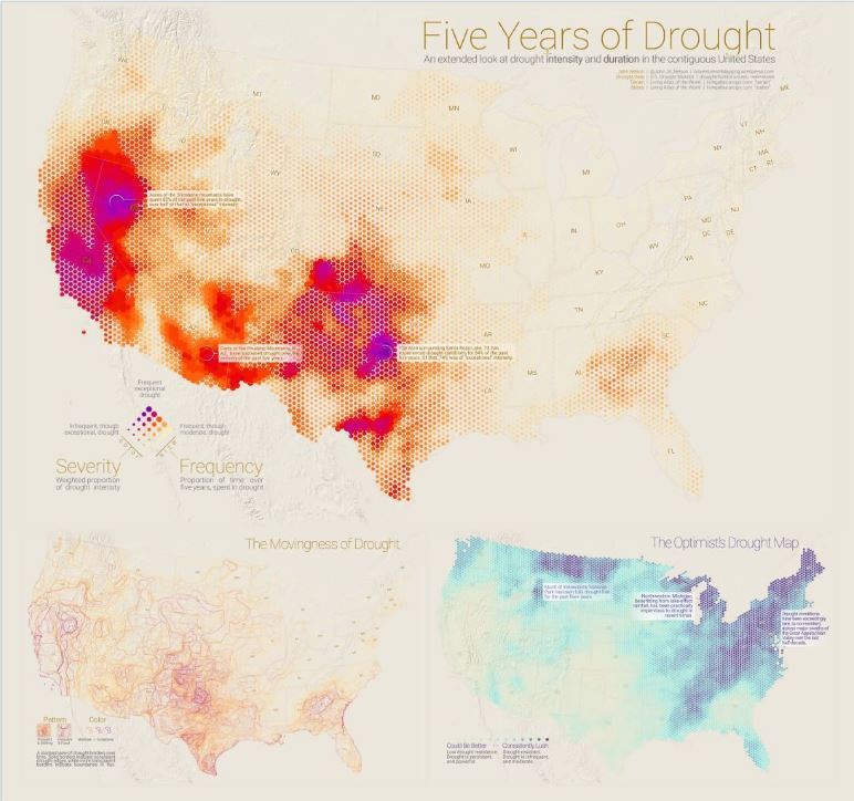
Five Years of Drought by John Nelson, which is shortlisted in the Data Journalism category.
Winners will be unveiled at a special ceremony at London’s Ham Yard Hotel on Wednesday 2 November, followed by a celebration in New York on Nov 15.
Previous award winners have included: Dear Data (2015), hand-drawn dataviz postcards by Giorgia Lupi and Stefanie Posavec, now a best-selling Penguin book; Raw (2014), an influential dataviz software from DensityDesign Research Lab; Bloomberg Billionaires Index (2013), by Bloomberg Visual Data; and CNN Home & Away (2012), a visual tracking recent war casualties by noted dataviz designers Stamen.